The Not-So-Great Present and The Bright Future of Mobile Web
It is striking just how big the mobile web grew, yet how poor the mobile user experience is.
Sites are reporting that 50-70% of the traffic is on mobile, yet their pages either don’t render at all or don’t render legibly on mobile. At best, a site claims to be mobile responsive, meaning that it renders legibly. The thing is, mobile web is not about just about page-by-page legibility.
Mobile web is about recognizing that the desktop web is going away. Mobile web is literally the new, future version of the web. And mobile experience is about fundamentally re-thinking how and why your business should present itself on mobile devices.
Pinch, Scroll and… Leave
When Steve Jobs showed off the first iPhone he called it a web navigator. Apple cleverly solved a problem of rendering pages on the much smaller devices using scaling, pinching and scrolling. When you arrived at the New York Times page, the original iPhone scaled the site down to make it fit the small screen of the phone. The user then could scroll around and zoom in on specific part of the page using the pinch gesture.
It was certainly cool back then. It was a wow. But now days, if the user comes across a news site that works like this she is much more likely to simply leave. The experience that original iPhone delivered is tolerable, but it is neither great nor delightful. And is certainly not something that modern user will put up with.
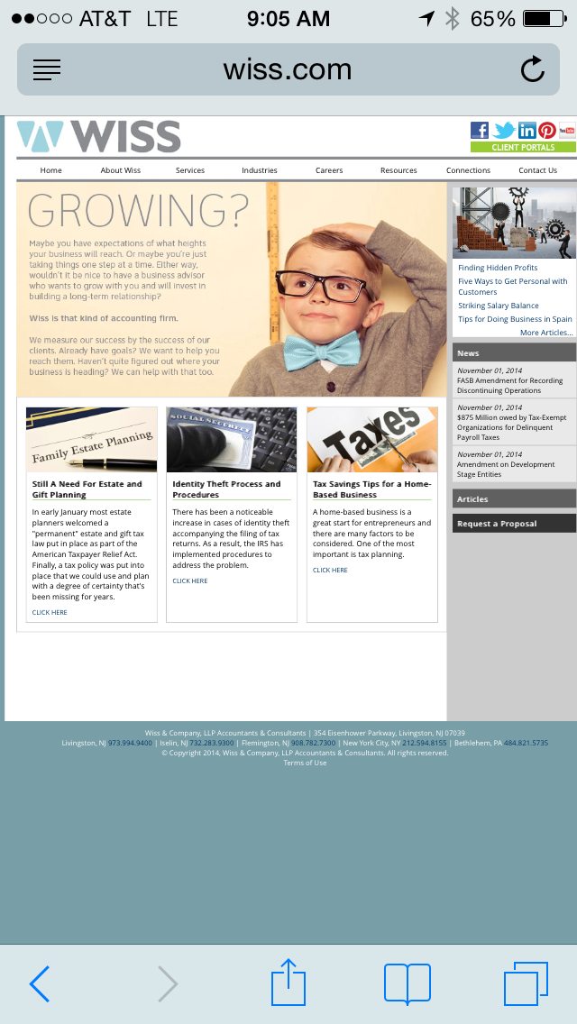
When you browse the mobile web today, you find a stunning array of sites that just don’t bother. Search for accountants or lawyers in NJ and you will find sites like Wiss and Skoloff & Wolfe. Search for trendy restaurants in In NYC and you will discover that ABC Kitchen and The Spotted Pig don’t care about their mobile sites.


One might argue that smaller businesses can’t afford it or can’t afford to bother to have a legible mobile site. Lets face it, this is not a real argument. It isn’t expensive to have a mobile site. And not having mobile presence is increasingly costing these small businesses $$ and customers.
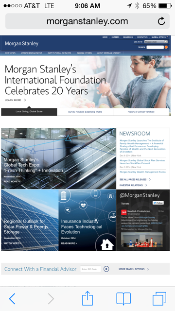
But lack of mobile presence is not just specific to small businesses. Large companies are at fault too. Besides publishers and retailers, who are forced to have a mobile story, others are slow to move. Visit top legal firm Gunderson, investment bank Morgan Stanley or Bain Capital for some examples of corporate failure to respond to mobile.


The Trouble with Responsive Design
So whats the big deal you say? All of these sites can be easily fixed using so-called Responsive Design. The idea behind it, is to present the same content that is presented on the desktop web, but using different layout style — the one that fits smaller mobile devices.
Responsive Design is actually a really clever idea. It comes with a toolbox of geometric tricks and best practices to guarantee that each page appears correctly and friendly on mobile. The biggest problem with Responsive Design, is that it underemphasizes the most important and powerful operation – REMOVE.
That’s right, trying to squeeze all the content that used to fit on the desktop into mobile is ridiculous. Responsive design focuses, perhaps even unintentionally, on how to adapt existing desktop sites, how to salvage the precious content to ensure that all things fit.
And thats exactly its flaw. Responsive design pushes us to think about sub-optimal mobile experiences.
Here is a list of some things, in no specific order, that go wrong with mobile sites.
- Too much information — mobile site is a literal translation of a desktop site, and it becomes overwhelming to use inside small space.
- Bad navigation — top level navigation has too many items and/or its hard to click.
- Issues with search — having clear way to search the content is important on mobile for many sites. Some make the search hidden, some make it hard to click, and yet another ones make search box hard to use once it expands.
- Colors and fonts are off — poor choices of colors and fonts are particularly acute on mobile. For starters, tiny fonts are huge turn off. Then there is too many different fonts, italics and bolds that make it hard to read the actual content. And then there are too many colors or poor color choices. We all get that red is part of Target’s brand, but making the font in the search box on mobile red is just plain odd (note that they don’t do it on the desktop).
The point is that it is easy to make mobile experience bad, even if you are using Responsive Design, and a lot of sites manage to do just that.
Starting from Scratch
Mobile UX needs to be re-thought from scratch. It should be beautiful, it should be minimalistic, and it needs to be simple.
Mobile gives us a chance to free ourselves from old desktop information paradigms, and to simplify. Less space means less information, and it is better that way.
Lets look at one example, Amazon.com. The mobile experience is obviously simpler and better:


Amazon is perhaps one of the best examples of Responsive Design done right. Yet, it still does not feel like Amazon cracked the code on mobile shopping. The experience still feels like desktop for the most part. It is clean, but it is not mobile first, its not designed from ground up for mobile user.
We already have plenty of examples of mobile UX done right. They are called apps and we love them.
Apps really raised the bar on re-thinking the desktop and making new UX feel truly native on mobile. The problem with apps? You can only have so many of them. There is no way to download the app for every single web site. It just does not make sense.
Likely, a better route is for many commercial mobile sites to be more app-like. Technically, we are getting close to the state of mobile browsers and JavaScript being able to create experiences that feel like native apps. So now, it is really just a matter of investing time and doing it.
There is a big opportunity for designers and product managers to help the businesses generate more revenue on mobile. They can do that by thinking through the use cases, and asking what is the user looking for, what is her current context, and how we can help her find what she is needs and transact in the simplest possible way.
In some cases, the answer will be a clean, thoughtful Responsive Design. In other cases, the better answer will be to forgo the pages paradigm and deliver app-like mobile site.
Whatever the answer is, each business needs to race to find its mobile story and mobile identity today, right now.
*** DISCLOSURE *** Techstars NYC 2015 Winter Batch includes a company that helps restaurants build and maintain mobile web sites.
Alex Iskold View All →
Engineer, Immigrant. Vegan. 3x Founder, Managing Partner @2048vc. Previously ran @techstars in NYC. I write #startuphacks: http://alexiskold.net .

2 Comments Leave a comment ›